Quick answer
- Name the one decision you need reviewed.
- Put the brief on the walkthrough’s intro card.
- Record the route, then rewrite each step around what to notice.
- Make every reviewer reach the same key moment.
- Ask for replies about moments, then test without the guide.
Mira is a product designer at Slotly, a booking app for clinics. She has changed how rescheduling works. Patients used to cancel an appointment and book a new one. Now they can move it in one go, and their current slot stays booked until they confirm the new time.
That last part is the whole design. If patients think their old slot is gone the moment they tap a new time, they’ll panic, or they’ll close the modal and lose a perfectly good appointment.
Mira wants her team to review it this week. Her product manager is in another timezone, the engineer is heads-down until Thursday, and the clinic success lead only has odd gaps between calls. A review meeting would take a week to schedule. So she runs the review asynchronously, on the working prototype.
Mira, Slotly and the patient Priya are a teaching example. The screens are real HeyProto screens, recorded on a small sample prototype built for this article.
Name the one decision you need
Mira’s first draft of the review request said “Please take a look at the new rescheduling flow.” Everyone would have looked at different things: the colours, the calendar, the copy on the cancel button.
So she wrote down the one question she needs answered:
Is it clear when Priya’s original appointment is released?
That question decides everything else. It decides where the review starts (Priya’s existing Tuesday booking), which steps matter (open Reschedule, pick a time, confirm) and what’s out of scope (directions, cancelling, reminders).
Nielsen Norman Group’s advice on keeping design critiques on track makes the same point: tell reviewers what you want feedback on before you show the work.
Put the brief where reviewers start
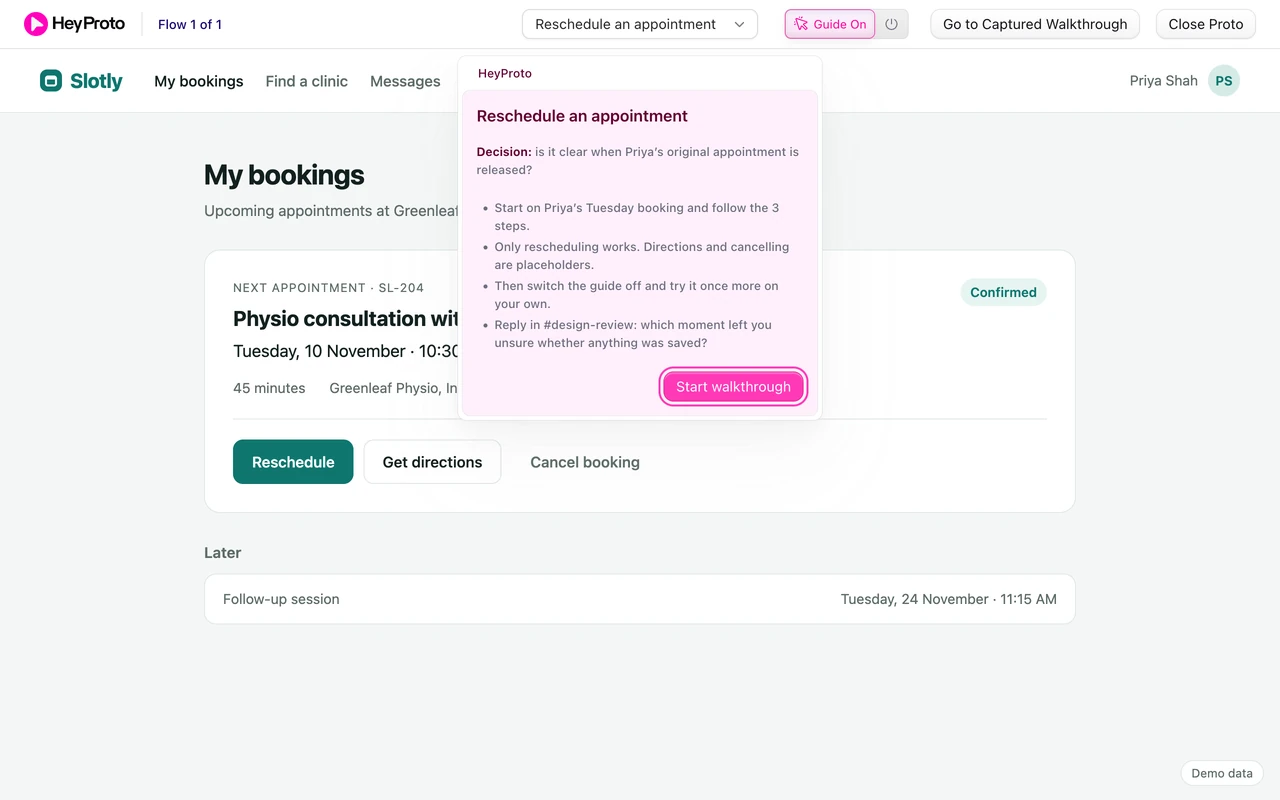
Mira could paste the brief into Slack and hope people read it before they click the link. Instead she puts it on the walkthrough’s intro card, the first thing reviewers see when they open the prototype.
The intro card says the decision in bold, then four short lines: where to start, what’s real, what to do after the guided run, and where to reply. It’s the first thing they read, before they press Start walkthrough.
Record the route in three clicks
Mira opens the prototype in Chrome, clicks the HeyProto icon and starts recording. She clicks Reschedule, picks Thursday at 10:30, and confirms. Each click becomes a step, with a screenshot and the button it points at.
The recording gives her the route. It doesn’t give her the review. HeyProto names each step after the button (“Click 10:30 AM”), which tells reviewers what to click but not what to look at.
Rewrite each step around what to notice
So Mira rewrites each step in the editor. The titles say where the reviewer is. The instructions say what to judge there.
Step 2 is where patients pick a new time. Her rewritten instruction reads: “Choose Thursday at 10:30. Nothing is saved yet. Does the screen make that clear enough?” The highlight stays on the Thursday 10:30 button, and Next still moves on when the reviewer clicks it.
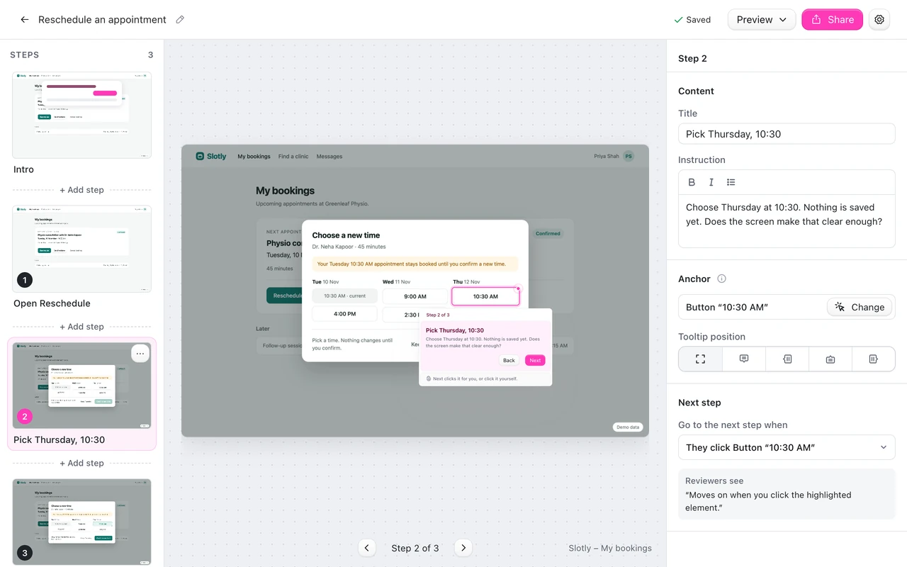
| Step | Mira’s instruction | What the reviewer judges |
|---|---|---|
| Open Reschedule | Read what it promises about her current slot. | Is the “stays booked” promise visible? |
| Pick Thursday, 10:30 | Nothing is saved yet. Does the screen make that clear enough? | Does picking a time feel safe and reversible? |
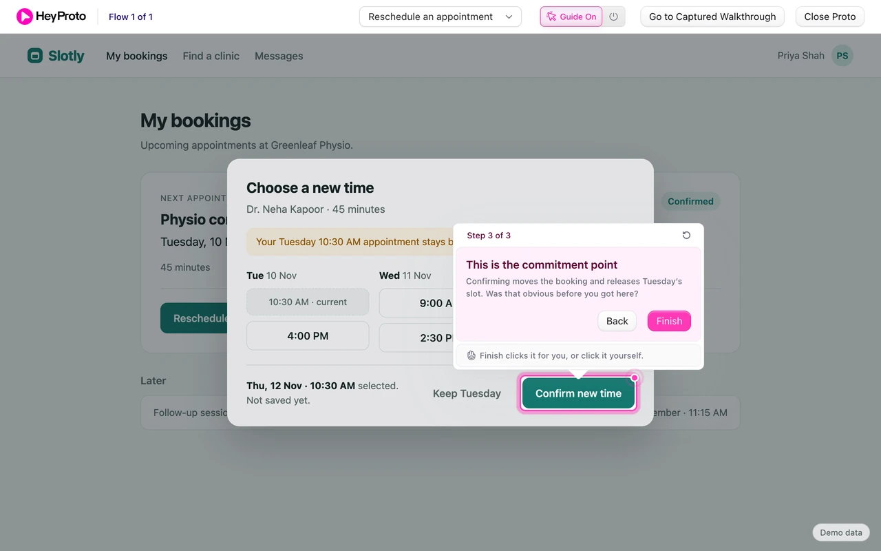
| This is the commitment point | Confirming releases Tuesday’s slot. Was that obvious before you got here? | Is the point of no return clear? |
There’s one trap she avoids. If the only place that says “nothing is saved yet” is her walkthrough, the review has found missing interface copy. The guide points at the product’s own words; it doesn’t replace them. Mira checks that the modal itself says “Not saved yet” before relying on it.
Show the moment that matters
The third step is the one the whole review exists for. In the live prototype, the reviewer has Thursday selected, the footer says “Thu, 12 Nov · 10:30 AM selected. Not saved yet.”, and the guide points at Confirm new time.
The step’s title says it plainly: “This is the commitment point”. Every reviewer reaches this exact screen, with the same state, whenever they open the link. That’s what makes an asynchronous review work: people answer the same question about the same moment.
Let reviewers finish and reply
After Confirm new time, the booking card updates to Thursday and shows “Moved to Thursday, 10:30 AM. Your Tuesday slot has been released.” HeyProto marks the flow as reviewed. The reviewer has now seen the promise, the safe choice, the commitment and the result.
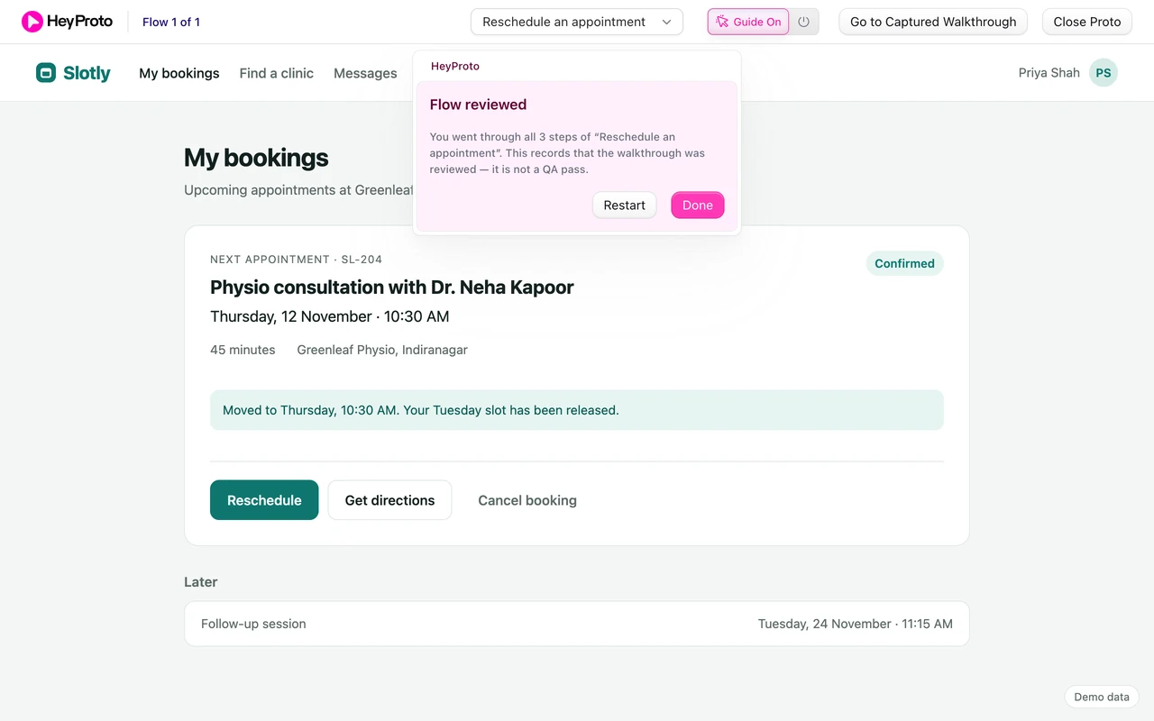
The intro card asked them to reply in #design-review with one thing: the moment, if any, where they weren’t sure whether anything was saved. Suppose the clinic success lead replies, “I thought tapping Thursday had already moved it.” That’s a reply Mira can act on: the selected state needs to say “Not saved yet” more loudly, closer to the slot.
Then remove the guidance
A guided review tells you whether your team understands the design intent. It doesn’t tell you whether patients find Reschedule on their own. That’s why the brief asks reviewers to switch the guide off and try once more.
For real discoverability, Mira would run a separate, unguided session with a task like “Your plans changed. Move your physio appointment to Thursday morning.” NN/g’s task-scenario guidance explains why the task shouldn’t name the button.
For more on writing review requests, read how to get useful prototype feedback. For the recording basics, see how to create a product walkthrough.
Frequently asked questions
Do reviewers need to install anything?
For the live, guided prototype they need the HeyProto Chrome extension and access to the prototype. If they only need to see the screens, you can share the captured walkthrough instead, which opens in any browser.
What if the flow starts inside a modal?
Record the clicks that open it. A URL usually can’t reopen a modal on its own, so start the walkthrough on a page reviewers can reach, like Priya’s bookings page.
Can I use this for a Figma prototype?
HeyProto guides working web prototypes, where it can point at real page elements. Figma’s prototype player draws its frames on a canvas, so check your prototype runs as a real web page first.